This tutorial will show how to create a box, add color, and position it on the page.
Step 1:
To create a box we will use the height and width functions. These functions can be applied to all HTML elements except non-replaced inline elements. We will also apply color in this step as it will allow us to see the box we have created. We will use a div to create our box.
Using fixed height and width.
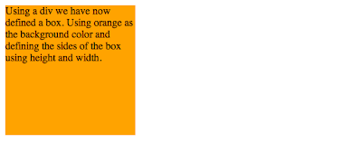
<div style="background-color: orange; height: 200px; width: 200px;">Using a div we have now defined a box. Using orange as the background color and defined the sides of the box using height and width.
</div>
The result is this.
Step 2:
We can now define the box to have max-widths and max-heights or min-widths and min-heights.
<div style="background-color: orange; max-height: 200px; max-width: 200px;">The max-height and max-width tool allow the box to bound the text better, but will not allow width or height to exceed the defined amount.</div>
The result is this.
Step 3:
We can also define the box to have min-heights and min-widths.
<div style="background-color: orange; min-height: 200px; min-width: 200px;">The min-height and min-width tool tell the box that it cannot be smaller than the defined amount.</div>
The result is this.
Step 4:
Now that we know how to create a box and define its size we can learn how to position the box on the page using relative positioning.
<div style="position: relative; left: 100px; background-color: orange; height: 75px; width: 100px;">This box has relative positioning.</div>
The result is this.
Other elements are not effected by this positioning which can cause overlapping.
Step 5:
There are other types of positioning as well; absolute and fixed. Fixed positioning allows the box to be fixed on the page. In other words the box will remain in one place as the remainder of the page is allowed to scroll.
Thursday, September 23, 2010
Thursday, September 2, 2010
Site Critique
My first time blogging. This should be interesting as I've never even thought about starting a blog before. This blog has materialized from a class at USU as a way to discuss the processes used throughout design. Our first blog assignment is to find two websites that we like (one done with HTML and one done in Flash) and then discuss what we think makes these websites successful.
After surfing the web for a while (and mainly looking at design oriented websites) I finally settled on the two sites to discuss. They are Mephobox box.mepholio.com and Section Seven sectionseven.com. Both websites have to do with design; Mephobox seems to have been created as a site for designers to post their own websites, and the Section Seven website is designed as a portfolio website for the design firm of the same name.
Mephobox
The thing what I liked about Mephobox, almost right away, is the easy access to other designer's websites. It gives you thumbnail previews so you have an idea of what the sites look like before you access them. Along with showing others websites it also has collections of designs submitted by the users of Mephobox.
The site is very easy to navigate and contains just a few different main pages which makes it almost impossible to get lost in the site.
The colors on the page are bright, bold, and fun, however, the background texture bugs me as it is not just one full texture but is broken into boxes. I find it distracting. The typography is simple and relatively uniform throughout the website (when you go from one page to the next you know you're still in the same website). There is also a good visual hierarchy throughout the website; the main logo is the largest and the main page links are next largest in size and so on.
The website is geared toward designers and people looking for designers. It looks like a fun way to share your work with others and get a little exposure in the process. I think the site accomplishes its goals and is a very simple tool for designers to get their work some exposure.
Section Seven
This site is built as a portfolio site for the design firm. My favorite of the two sites (I wouldn't say Mephobox was spectacular, but it was effective). I really liked the way Section Seven organized the navigation of the site.
Subscribe to:
Posts (Atom)